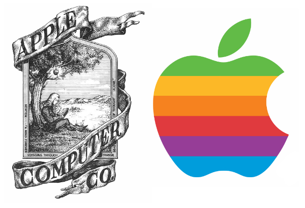
Talk about humble beginnings! Apple’s logo and image have come a long way…
According to Steve Jobs, Apple was so named because Jobs was coming back from an apple farm, and he was on a fruitarian diet. He thought the name was “fun, spirited and not intimidating”.
Apple’s first logo, designed by Ron Wayne, depicts Sir Isaac Newton sitting under an apple tree. It was almost immediately replaced by Rob Janoff’s “rainbow Apple”, the now-familiar rainbow-colored silhouette of an apple with a bite taken out of it. Janoff presented Jobs with several different monochromatic themes for the “bitten” logo, and Jobs immediately took a liking to it. While Jobs liked the logo, he insisted it be in color to humanize the company. The logo was designed with a bite so that it would not be confused with a cherry.The colored stripes were conceived to make the logo more accessible, and to represent the fact the Apple II could generate graphics in color.[ This logo is often erroneously referred to as a tribute to Alan Turing, with the bite mark a reference to his method of suicide. Both Janoff and Apple deny any homage to Turing in the design of the logo.
In 1998, with the roll-out of the new iMac, Apple discontinued the rainbow theme and began to use monochromatic themes, nearly identical in shape to its previous rainbow incarnation, on various products, packaging and advertising. An Aqua-themed version of the monochrome logo was used from 2001–2003, and a Glass-themed version has been used since 2003.
Steve Jobs and Steve Wozniak were Beatles fans, but Apple Inc. had trademark issues with Apple Corps Ltd., a multimedia company started by the Beatles in 1967, involving their name and logo. This resulted in a series of lawsuits and tension between the two companies. These issues ended with settling of their most recent lawsuit in 2007.

