Custom Bat/Bar Mitzvah Logo Design
Reply
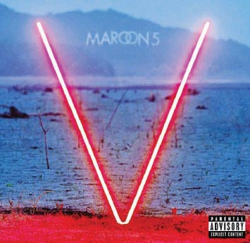
Inspired by the amazing work of Nick Barclay, an Australian graphic designer, here is my vision of a minimal design for Maroon 5’s fifth album cover.

 scph5501.bin bios for pcsx2
I love the art of Ruth Asawa (1926 to 2013), who is nationally recognized for her wire sculpture, public commissions, and her activism in education and the arts. Her three dimensional sculptures are simple, beautiful and timeless.
London-based graphic designer Nick Barclay puts your music knowledge to the test with his minimalist recreations of classic album covers…
Logorama s a 16-minute French animated film written and directed by H5/François Alaux, Hervé de Crécy and Ludovic Houplain, and produced by Autour de Minuit. The film depicts events in a stylized Los Angeles, and is told entirely through the use of more than 2,500 contemporary and historicallogos and mascots. The film won the Prix Kodak at the 2009 Cannes Film Festival and the Academy Award for Best Animated Short Film at the 82nd Academy Awards.[1]
(Please note: This film contains some bad language and may not be appropriate for children)
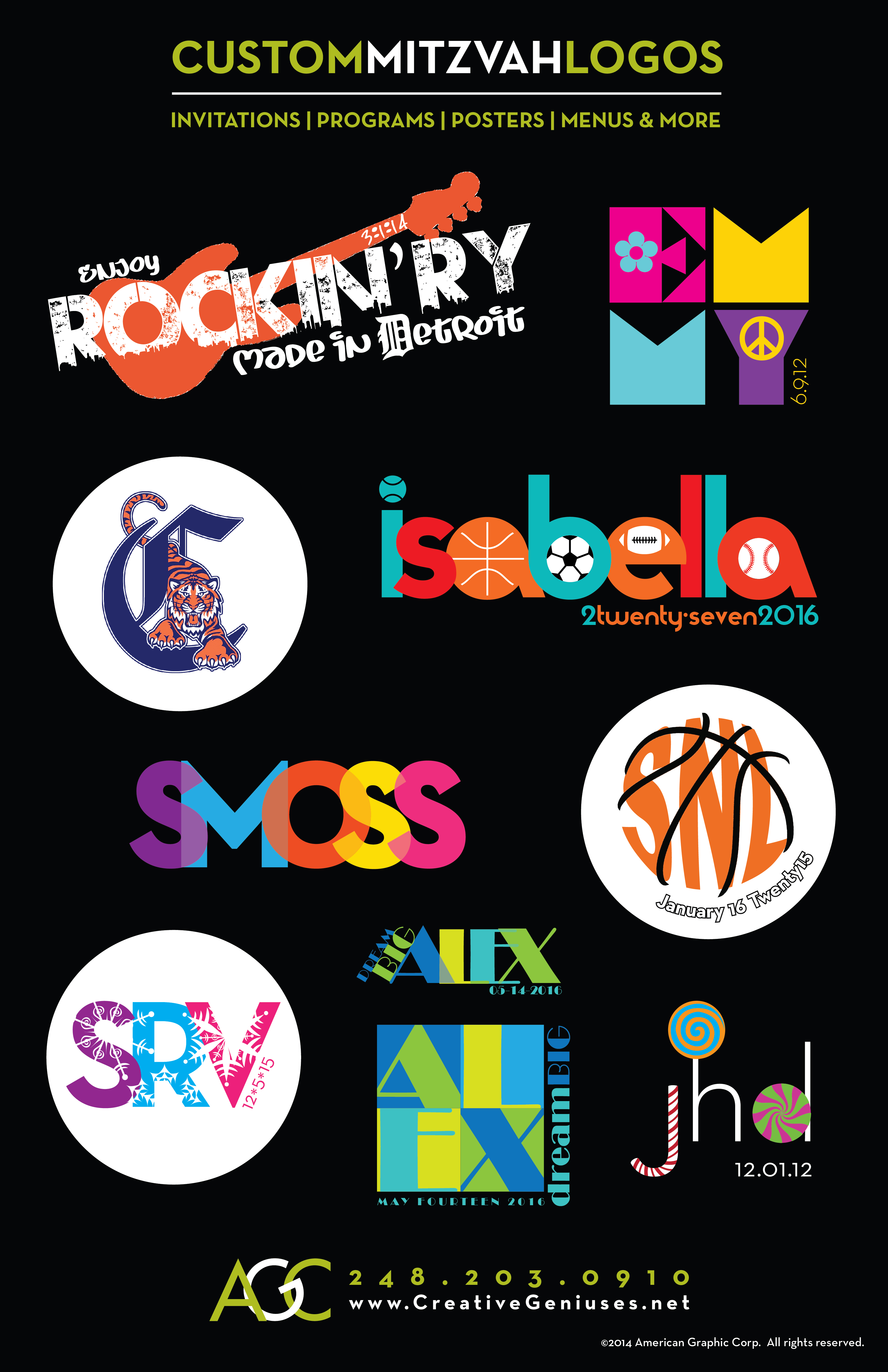
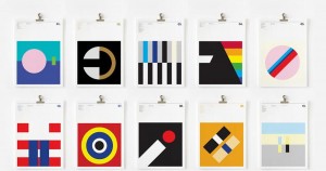
![]() Logos are everywhere. They’re on billboards, signs, clothes, buildings, packaging, at weddings and bat mitzvahs… but not all logos are created equal. Many logos are overworked, nonsensical, over-detailed, incohesive, using too many fonts and mismatch color schemes… and worst of all not relating to the product or service they are intended to represent.
Logos are everywhere. They’re on billboards, signs, clothes, buildings, packaging, at weddings and bat mitzvahs… but not all logos are created equal. Many logos are overworked, nonsensical, over-detailed, incohesive, using too many fonts and mismatch color schemes… and worst of all not relating to the product or service they are intended to represent.
I believe that clarity and simplicity are the key. A great logo design conveys a clear and simple message about the product or service that it represents. It doesn’t confuse or distract. A good logo conveys a mood, a feeling, an emotion. Without words it tells a story. A great logo gets noticed and is remembered.
I have been a graphic designer for more then 20 years and designing logos is my passion. I love the challenge of taking a business, an event or a product and translating it into a single, clear, simple and memorable icon.
The logo shown in this post was designed for my niece Sara Moss for the occasion of her Bar Mitzvah. Sara’s nickname is SMOSS. She wanted a bright, happy logo for her Street Festival themed Bar Mitzvah party in San Francisco!
Artist Pablo Stanley transformed an incredible song into an awesome comic strip that conveys a strong message about peace and unity in the world… Love this…


Talk about humble beginnings! Apple’s logo and image have come a long way…
According to Steve Jobs, Apple was so named because Jobs was coming back from an apple farm, and he was on a fruitarian diet. He thought the name was “fun, spirited and not intimidating”.
Apple’s first logo, designed by Ron Wayne, depicts Sir Isaac Newton sitting under an apple tree. It was almost immediately replaced by Rob Janoff’s “rainbow Apple”, the now-familiar rainbow-colored silhouette of an apple with a bite taken out of it. Janoff presented Jobs with several different monochromatic themes for the “bitten” logo, and Jobs immediately took a liking to it. While Jobs liked the logo, he insisted it be in color to humanize the company. The logo was designed with a bite so that it would not be confused with a cherry.The colored stripes were conceived to make the logo more accessible, and to represent the fact the Apple II could generate graphics in color.[ This logo is often erroneously referred to as a tribute to Alan Turing, with the bite mark a reference to his method of suicide. Both Janoff and Apple deny any homage to Turing in the design of the logo.
In 1998, with the roll-out of the new iMac, Apple discontinued the rainbow theme and began to use monochromatic themes, nearly identical in shape to its previous rainbow incarnation, on various products, packaging and advertising. An Aqua-themed version of the monochrome logo was used from 2001–2003, and a Glass-themed version has been used since 2003.
Steve Jobs and Steve Wozniak were Beatles fans, but Apple Inc. had trademark issues with Apple Corps Ltd., a multimedia company started by the Beatles in 1967, involving their name and logo. This resulted in a series of lawsuits and tension between the two companies. These issues ended with settling of their most recent lawsuit in 2007.