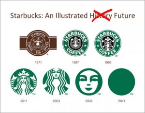
 It happens all the time—logos get makeovers. Sometimes for the better and unfortunately sometimes not. In this Adweek article, one designer illustrates the evolution of the Starbucks logo as it began and where it might go In the future. Based on the modifications made to date, the designer shows the logo being simplified to a green circle by 2041.
http://adweek.blogs.com/adfreak/2011/01/starbucks-logo-timeline-of-future-redesigns.html.
